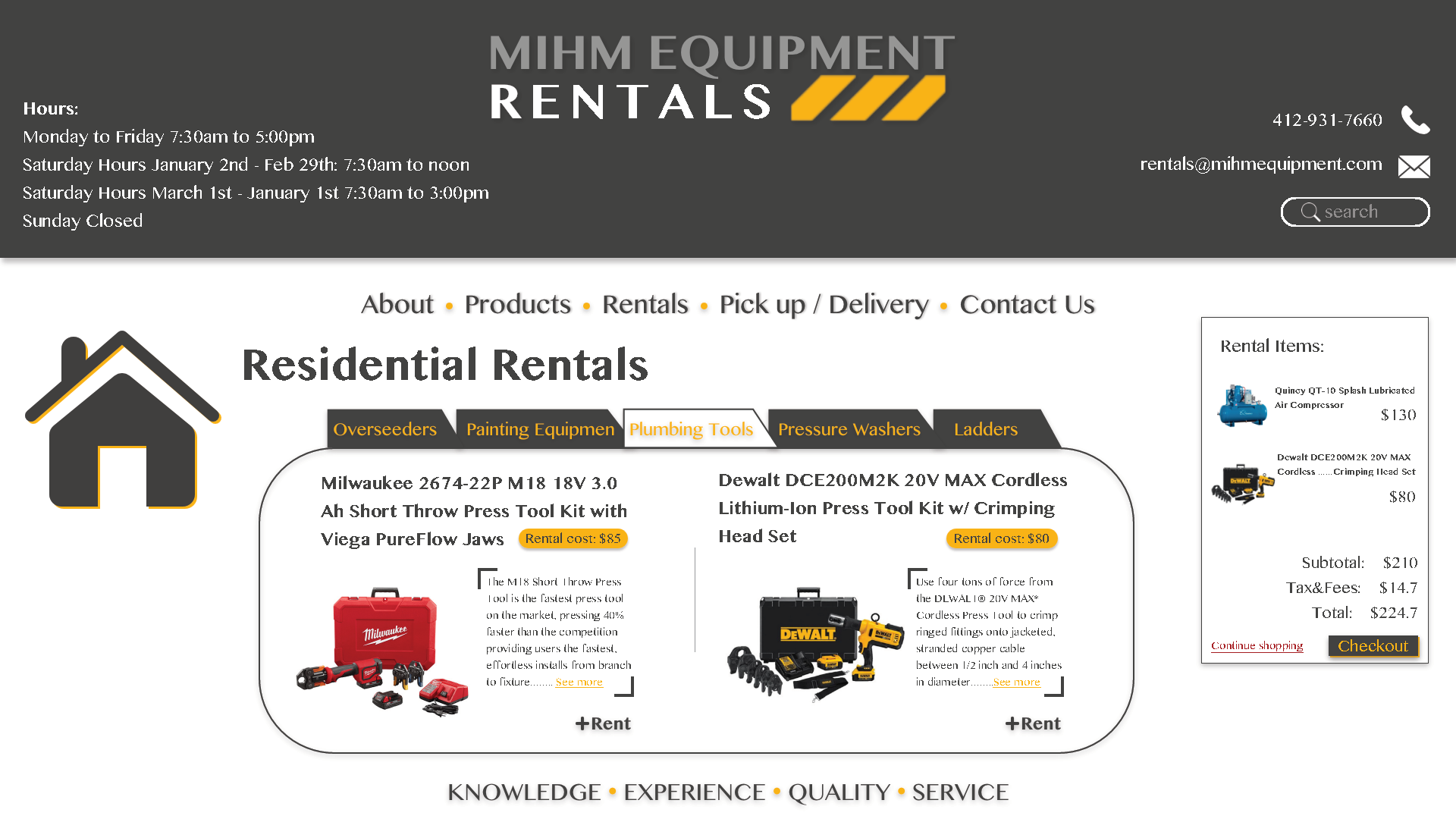
Construction Rentals Site Analysis
The Challenge
As part of my graduate studies, I took part in a collaborative project on behalf of a MIHM Rentals, a local business. My team was responsible for performing a usability analysis on the company’s existing website to inform a team working on the site redesign. We were asked to create a concise usability summary on a very short time frame in which we would recommend a set of changes based on our user research and study findings. While working with this team, I was primarily responsible for leading in-person user testing and eye-tracking sessions.
Our full analysis can be found here.
Software Used used: Balsamiq, Gazepoint Eye-Tracking Software, TechSmith Morae, Illustrator
The Process
Given the tight deadlines of the project (just over a week from start to finish), our team acted as the initial testing group for the existing site. In this first session, we familiarized ourselves with the basics of the site and noted and pain points or issues we faced in general, undirected navigation. From our rough initial findings, we created a series of tasks for users to complete in the first of two rounds of usability testing. These tasks would reflect the various pain points that our team identified in our initial overview.
Our first round of testing was comprised of one-on-one user testing sessions in which the participants were asked to perform common tasks while an eye-tracking recorder captured their activity. The users consistently reported that they had trouble finding much of the content, as several links did not lead to pages the users expected to navigate to. In one notable example, a section that appeared to be several discrete links in fact was a series of identical links to the same page. When reviewing the eye-tracking feeds, we noticed that participants often struggled to spot desired information, even when they were looking in the correct area of the screen.
In our second round of testing, we used TechSmith Morae software to observe a new set of users completing the tasks from the first round of testing. In this series of tests, users were asked to give verbal feedback of their thought process as they attempted to complete the designated tasks. The results in this second round of analysis matched our first, with multiple users describing frustration in trying to navigate between pages. Furthermore, our users noted that finding relevant information was difficult as they often found themselves scanning the site’s FAQ section seeking the appropriate information.
Based on the results of both tests, it was revealed that all users had difficulty interacting with the site as the original design had little to no interactive elements. We recommended an expansion of the site to include interactive features such as an online contact method, specific product information/specifications, and the inclusion of online product availability and ordering information. These recommendations, and other issues noted by our team, were addressed in a series of wireframes and visual comps. The full report of our findings and recommendations was submitted to company for use in future site improvements.


