Twitch Website Redesign
The challenge
This is the result of a short-term UX analysis challenge. For this challenge, I was tasked with analyzing and proposing a redesign of the Twitch mobile app. Using Norman’s principles of design as a guide, I was asked to note any deficiencies in the existing design and propose changes to address them. I was also asked to perform an eye-tracking survey of popular steaming sites to determine where a viewer's focus is drawn to when watching a stream.
View the eye-tracking study results and the Twitch redesign summary.
Tools used: Adobe Illustrator, Gazepoint Eye-Tracking software, Microsoft Visio
The research - Streaming Sites
Before beginning my analysis of the Twitch app, I first researched several existing sites used for game streaming. Noting similarities in their designs, wile most of the sites featured similar designs, there were a few notable differences in how they handled their chat features. In an effort to account for users of different backgrounds, I hypothesized that non-gamers might view a game stream differently from ganers. I devised a series of eye-tracking studies, in which users were shown a set of pre-recorded streams of the game League of Legends. I chose this game due to its established following in the streaming community, but also because in-game action tends to follow a consistent flow for analysis purposes.
The studies revealed striking differences in the way that gamers and non-gamers view content on the sites. The self-described gamer participants tended to follow the action of the game, whereas non-gamer participants instead tended to view the page in a circular pattern, switching their view from the game itself to other elements on the page, Examples of these eye tracking studies can be viewed below.
Eyetracking Study Example: Gamer Group
Eyetracking Study Example: Non-Gamer Group
The Process - Twitch Redesign
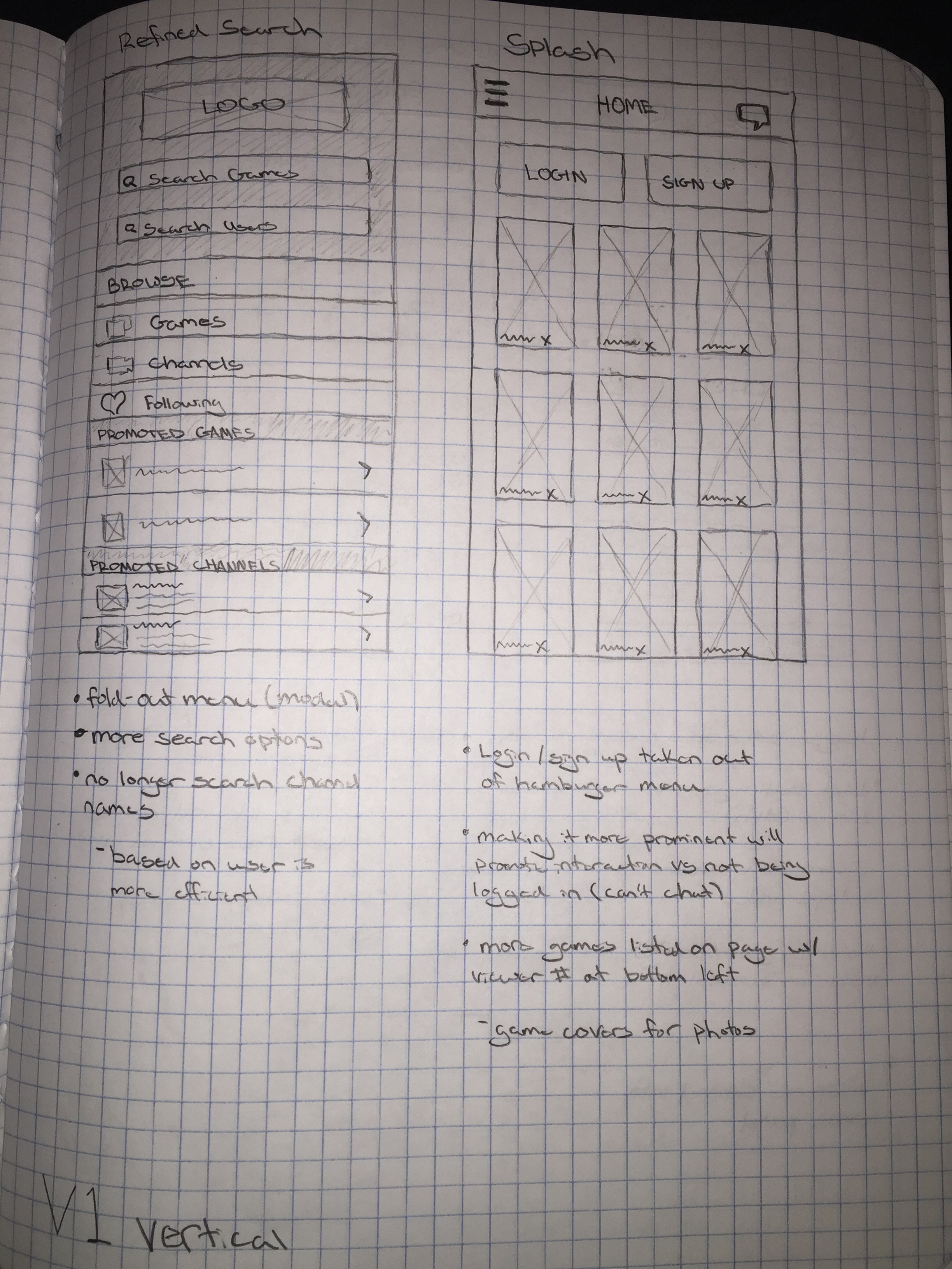
Using again Norman’s principles and my eye-tracking data as a guide I turned to the existing application to identify any deficiencies in its then-current design. I also compiled a competitive analysis of similar apps, such as Hitbox and USTREAM. I identified significant problems with consistency between screens, visibility of key elements like menus, and landscape display functionality as the most pressing concerns. With this information, I created sketches and a rough paper prototype to illustrated my proposed interaction changes. A series of tasks were devised to test the usability of the paper prototypes.


After performing a round of user testing with the paper prototype, the designs were revised and re-tested. I then created a series of wireframes for the improved designs and incorporated a landscape layout for the app, a feature that was at the time nonfunctional in the original app. After another round of user testing, I created a set of colored visuals in Adobe Illustrator to provide a feel of the final look for the redesigned app. A final round of testing was performed to ensure that both configurations of the new design were easily navigable and that users could complete the designated taskflow easily.


